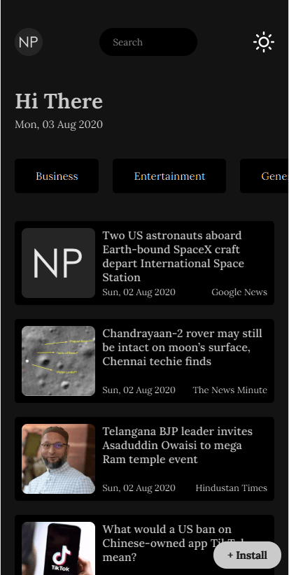
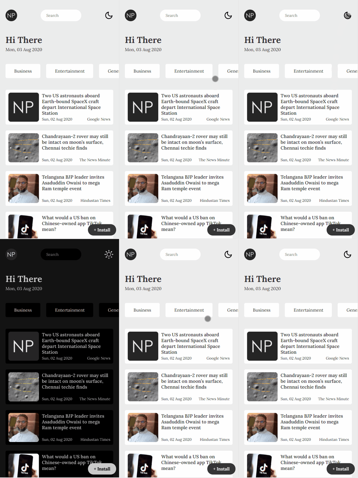
One line – Dark Mode using CSS:
This is an absolute no-brainer method of converting an already developed website to support dark mode.
Without further ado let’s get into it! 👾
Now add the magic CSS
html[theme='dark-mode'] {
    filter: invert(1) hue-rotate(180deg);
}
Voila! you are done ✌
Explanation
Now let’s try and understand what is going on under the hood.
The
filter CSS property applies graphical effects like blur or color shift to an element. Filters are commonly used to adjust the rendering of images, backgrounds, and borders. (Reference: MDN Web Docs)
For this dark mode, we would be using two filters namely
invert and hue-rotate
invert filter helps to invert the color scheme of the application. So, black becomes white and white becomes black and similarly for all the colors.
hue-rotate filter helps us with all the other colors that are not black and white. Rotating Hue by 180 degrees, we make sure the color theme of the application does not change but just attenuate the colors of it.
The only catch with this method is, it will also invert all the images in your application. So we will add the same rule to all images to reverse the effect.
html[theme='dark-mode'] img{
    filter: invert(1) hue-rotate(180deg);
}
and we will also add a transition to the HTML element to make sure the transition does not become flashy!
html {
    transition: color 300ms, background-color 300ms;
}
from Tumblr https://generouspiratequeen.tumblr.com/post/625499855162327040


